 how-to
Can You Mix Pillow Patterns Without Clashing?
Last Updated: October 25, 2026
Quick Summary
You can mix pillow patterns without clashing by starting with one inspiration fabric and building a three-color palette, then varying pattern scale from largest to smallest. Give each pattern a clear role, keep one shared color, and add a solid between bold patterns so the eye gets rest.
- Pick one inspiration fabric first and pull a three-color palette from it: dominant, secondary, accent.
- Pair a large floral with a fine ticking stripe and keep one shared color between them.
- Arrange pillows using the 2-2-1 rule: two large, two medium, one accent lumbar.
- Use at least one solid for every two patterns to give the eye a pause.
- Choose an insert 1-2 inches larger than the cover on each side for a full look.
Table of Contents
- Start With an Inspiration Fabric and a Three-Color Palette
- How to Mix Floral and Striped Pillows Without a Clash
- Vary Pattern Scale: Largest to Smallest, Bold to Subtle
- Throw Pillow Color Combinations That Hold a Room Together
- How to Arrange Throw Pillows on a Sofa (and the 2-2-1 Pillow Rule)
- Add Texture, Solids, and Insert Sizing for Real Comfort
- Shop Ivy & Linen Covers to Build Your Mix
- Frequently Asked Questions
Start With an Inspiration Fabric and a Three-Color Palette
The fastest way to learn how to mix and match pillow patterns is to stop shopping for pillows and pick one fabric you already love, the same approach works for any set of pillow patterns you are building.
A common mistake is buying five pillows you like individually. They rarely work together. Instead, pull your palette from the anchor fabric itself:
- Three colors, no more. One dominant, one secondary, one accent.
- Match the mood, not the exact shade. Warm taupe and cool slate blue can coexist if the undertone agrees.
- Check the room. Pull a color from your rug, curtains, or wall art so the pillows belong to the space.
The principles of color theory from the interaction design foundation explain why three colors hold together: too many competing hues read as noise, while a tight palette reads as intent.
How to Mix Floral and Striped Pillows Without a Clash
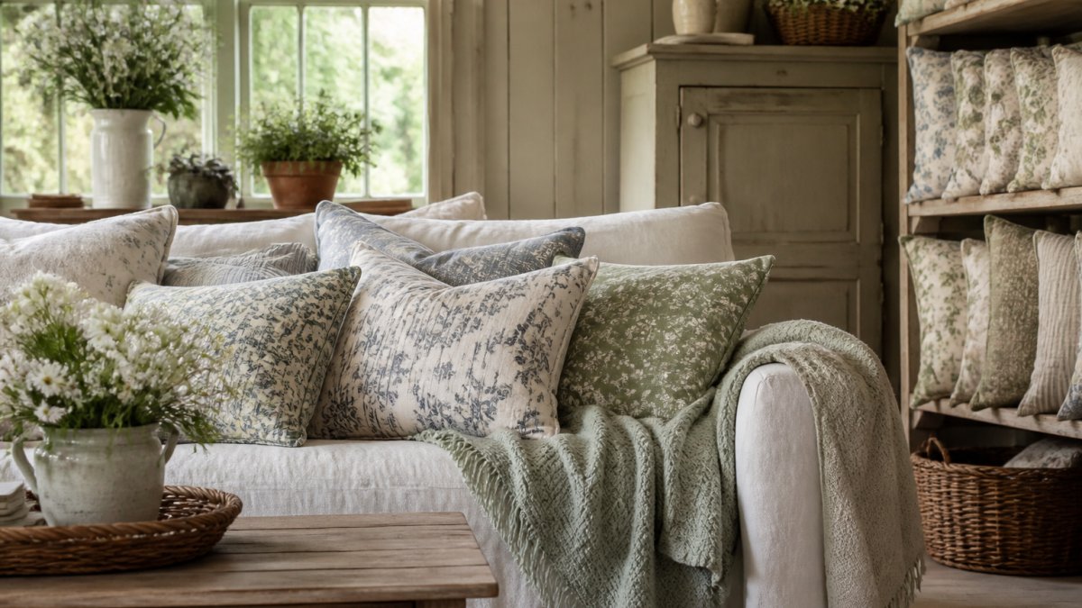
Florals and stripes clash only when they fight for the same job. Give each pattern a clear role and they cooperate beautifully.
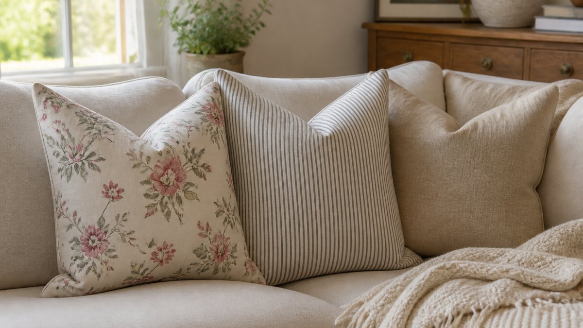
The trick is contrast in scale and calm in color. A busy floral wants a quiet stripe beside it. A bold stripe wants a soft, small floral.
Here is the pairing formula we recommend:
- Large floral + fine ticking stripe. The stripe reads as texture, not competition.
- Keep one shared color. If the floral has taupe leaves, let the stripe carry taupe.
- Add a solid between them. A plain linen pillow gives the eye a rest.
A classic ticking stripe is the easiest striped partner for a floral because its lines are thin and quiet. You can see the idea in our taupe ticking stripe pillow cover.
Vary Pattern Scale: Largest to Smallest, Bold to Subtle
Pattern scale is the size of the motif on the fabric, and it decides whether a mix feels calm or chaotic. The rule is simple: go largest to smallest.
Think of it as a hierarchy:
| Role | Pattern Scale | Example |
|---|---|---|
| Dominant | Large-scale | Big floral or toile |
| Secondary | Medium | Block print or damask |
| Accent | Small-scale | Ticking stripe or dot |
| Rest | None | Solid linen |
The largest pattern leads. The smallest punctuates. Skip the middle and the mix can look flat.
A richly patterned large floral makes a strong anchor for this hierarchy. Our vintage floral woven pillow features a big motif.
Throw Pillow Color Combinations That Hold a Room Together
The color combinations that work best repeat a hue across two or three pillows. That repetition is what makes a mix look collected instead of random, but repetition alone is not enough. What actually holds a room together is the relationship between color value (how light or dark a tone is), undertone (whether it leans warm or cool), and contrast ratio (how far apart two pillows sit on that light-to-dark scale).
Start by sorting your three palette colors into values:
| Role | Value | What it does |
|---|---|---|
| Dominant | Mid-to-light | Sets the calm base; covers the most pillow area |
| Secondary | Mid | Bridges dominant and accent; carries the motif |
| Accent | Dark or bright | Anchors the eye; used sparingly |
If all three colors sit at the same value, the arrangement reads flat no matter how pretty the hues are. Push one color lighter or darker and the mix gains depth without adding a fourth color.
Try these palettes for a cottage or farmhouse room, each built on that value spread:
- Cream (light), taupe (mid), soft sage (mid-dark). Calm and neutral, works in almost any light.
- Ivory (light), slate blue (mid), warm charcoal (dark). A French cottage feel with gentle contrast.
- Oatmeal (light), terracotta (mid), deep rust (dark). Warm and earthy for fall and winter.
Match the mood, then check the undertone
Warm and cool tones can coexist, but they need a shared undertone to avoid reading muddy. A warm taupe and a cool slate blue work together when both carry a hint of gray; they fight when one is distinctly yellow-based and the other distinctly blue-based. When in doubt, hold the two fabrics side by side in the room's daylight, not under store lighting, and look for whether one makes the other look dirty.
Calm versus high-contrast interiors
Contrast is a dial, not a rule. Readers who want a restful, low-contrast room should keep all three colors within two value steps of each other and let texture carry the variety. Readers who want a graphic, high-contrast look should place the darkest accent directly against the lightest dominant so the eye gets a clear focal point. Neither is more correct, the mistake is mixing a high-contrast accent into an otherwise low-contrast palette, which makes the accent look like an accident rather than a choice.
Troubleshoot a palette that reads wrong
- Everything looks washed out. You likely have three mid-value colors. Darken the accent by one or two steps.
- The mix feels noisy. You likely have two accents competing. Demote one to secondary by choosing a quieter, smaller-scale version of it.
- One pillow looks like it doesn't belong. Check undertone first, value second. A cool pillow in a warm room usually needs a warmer neighbor, not removal.
The color guidance from the Pantone Color Institute is a useful sanity check when you are unsure whether two tones sit well together, but the room's own light is the final judge.
One insider tip: photograph your palette in the actual room at three times of day. Daylight changes everything, and a color that looks right in the store can read cold on your sofa by afternoon.
How to Arrange Throw Pillows on a Sofa (and the 2-2-1 Pillow Rule)
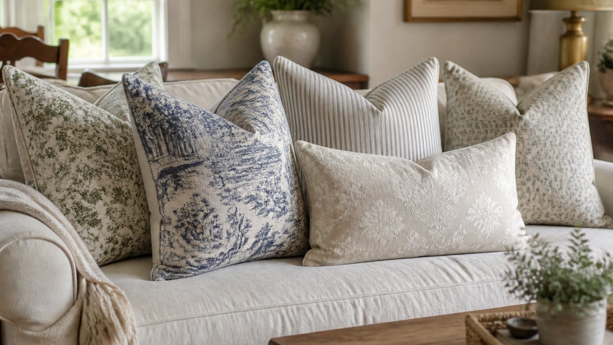
The 2-2-1 pillow rule means two large pillows at the back corners, two medium pillows in front of them, and one accent lumbar in the center. It gives you five pillows with a clear shape.
This arrangement works because it layers outward to inward and largest to smallest. The eye lands on the big back pillows, then travels to the accent.
Follow these steps:
- Place two large square pillows in the back corners, angled slightly inward.
- Add two medium pillows in front, one on each side.
- Finish with one lumbar in the center for contrast and comfort.
- Check the sofa size. A small loveseat takes three to four pillows; a large sectional can carry six.
For a symmetrical look, mirror both sides. The interior styling resources from House Beautiful echo this balance-first approach to sofa arrangements.
Add Texture, Solids, and Insert Sizing for Real Comfort
Texture is what makes a patterned mix feel rich rather than busy. A woven damask, a linen-look solid, and a smooth block print all catch light differently, and that variety does the quiet work that color and pattern cannot.
Solids are not filler. They are the pause between patterns. Use at least one solid for every two patterns, and place the solid where the eye needs rest, usually between the two boldest patterns or at the center of a symmetrical arrangement.
Insert-to-cover sizing: the numbers that matter
An undersized insert makes even a beautiful cover look flat and slouchy. The fix is simple arithmetic:
- Square covers: choose an insert 1-2 inches larger than the cover on each side. A 20×20 cover takes a 22×22 insert; an 18×18 cover takes a 20×20 insert.
- Lumbar covers: size up by 1-2 inches in length only, not height, so the pillow keeps its shape without bulging at the corners.
- Euro shams (26×26): a 28×28 insert gives the full, upright look shams are meant to have.
A cover that measures true to its insert will always look underfilled at the corners. Sizing up is the single biggest visual upgrade most people can make to an existing pillow.
Fill choices and the comfort trade-off
- Down or feather inserts give a soft, relaxed shape that karate-chops nicely and settles into a sofa. They need occasional fluffing and are not ideal for allergy-sensitive households.
- Polyester inserts hold a firmer, more structured look, cost less, and keep their shape with minimal fuss, good for high-traffic sofas and beds that get sat on.
- Down-alternative inserts split the difference: a down-like drape with easier care.
A practical rule: use firmer polyester inserts for back-support pillows and softer down or down-alternative inserts for the front accent and lumbar pillows. That way the arrangement looks layered and still feels comfortable to lean against.
Keep the arrangement functional
A decorative arrangement should not make the sofa unusable. Leave at least one seat's width free of pillows on a sofa people actually sit on, and choose a lumbar for the center rather than a third square, it supports the lower back and takes up less seat depth.
A versatile solid is the backbone of any mix. Our ivory linen-look pillow cover is the kind of quiet basic that lets your patterns breathe, and because it is a solid, it is also the easiest place to test a new insert size before you commit to a whole set.
Shop Ivy & Linen Covers to Build Your Mix
You now have the whole formula: one inspiration fabric, three colors, varied pattern scale, and the 2-2-1 arrangement. The only step left is choosing the covers.
At Ivy & Linen, our mix-and-match covers help you effortlessly elevate your living space. Each set pairs a floral, a stripe, and a solid in one palette.
Two sets show the formula in action:
- The slate blue French cottage pillow cover set combines a toile, a ticking stripe, and an ivory solid in soft slate blue.
- The earthy block print pillow cover set pairs terracotta and rust florals with a taupe ticking stripe.
Both are double-sided, so you can flip them for a fresh look without buying anything new.
Frequently Asked Questions
How many different pillow patterns should you use on one sofa?
Three patterned pillows is usually the ceiling for a single sofa, paired with one or two solids. Pick one large-scale pattern as the dominant design, one medium pattern as the accent, and one small-scale print or stripe to punctuate. Keep them tied together with a shared color palette of three to four colors. More than three patterns on a standard sofa starts to read as a cluttered look rather than a curated one, especially in smaller rooms.
What is the 2-2-1 pillow rule?
The 2-2-1 rule is a counting shortcut for pillow arrangements: two large square pillows at the back, two medium pillows in front of them, and one accent pillow, often a lumbar, at the center. It gives you five pillows in a balanced, symmetrical layout that suits most three-seat sofas. You can swap the center lumbar for a bold patterned accent if you want a focal point. Scale the rule down for a loveseat by dropping one of the medium pillows.
Can you mix floral and striped pillows in the same room?
Yes, and the pairing works well when the two patterns share a color. Choose a floral with a clear background and a stripe that repeats one of its accent colors, then keep the stripe narrower than the floral's motifs so the scales differ. A ticking stripe is the easiest stripe to pair because its lines are fine and read almost as a texture. Avoid pairing a large bold stripe with a busy floral of similar scale, since both compete for attention.
How do I know pillow covers will match furniture I already own?
Build around one inspiration fabric, such as a rug, artwork, or upholstery you already have, and pull three to four colors from it. Order covers in those colors and check them against the fabric in daylight before committing to the full set. If you are unsure, start with two covers rather than six. Double-sided prints give you two looks from one cover.
Mixing patterns can feel risky, but the formula removes the guesswork. Ivy & Linen makes it easier with vintage-inspired covers, coordinated mix-and-match sets, and double-sided prints that stretch every pillow further. Browse the collection, pick your inspiration fabric, and build a cozy, cottage-style room you will love. Get started with Ivy & Linen and transform your space with covers made to layer.